Concept project · Skin clinic
VELORA
A concept project for a skin clinic. A mark joining the letters V and e, plus a burgundy palette, carry through the logo, the feed and the landing page.
Based in Israel, working with brands worldwide. Hebrew on the packaging means real, printed work for our Israeli clients; your project, calls and files run in English.

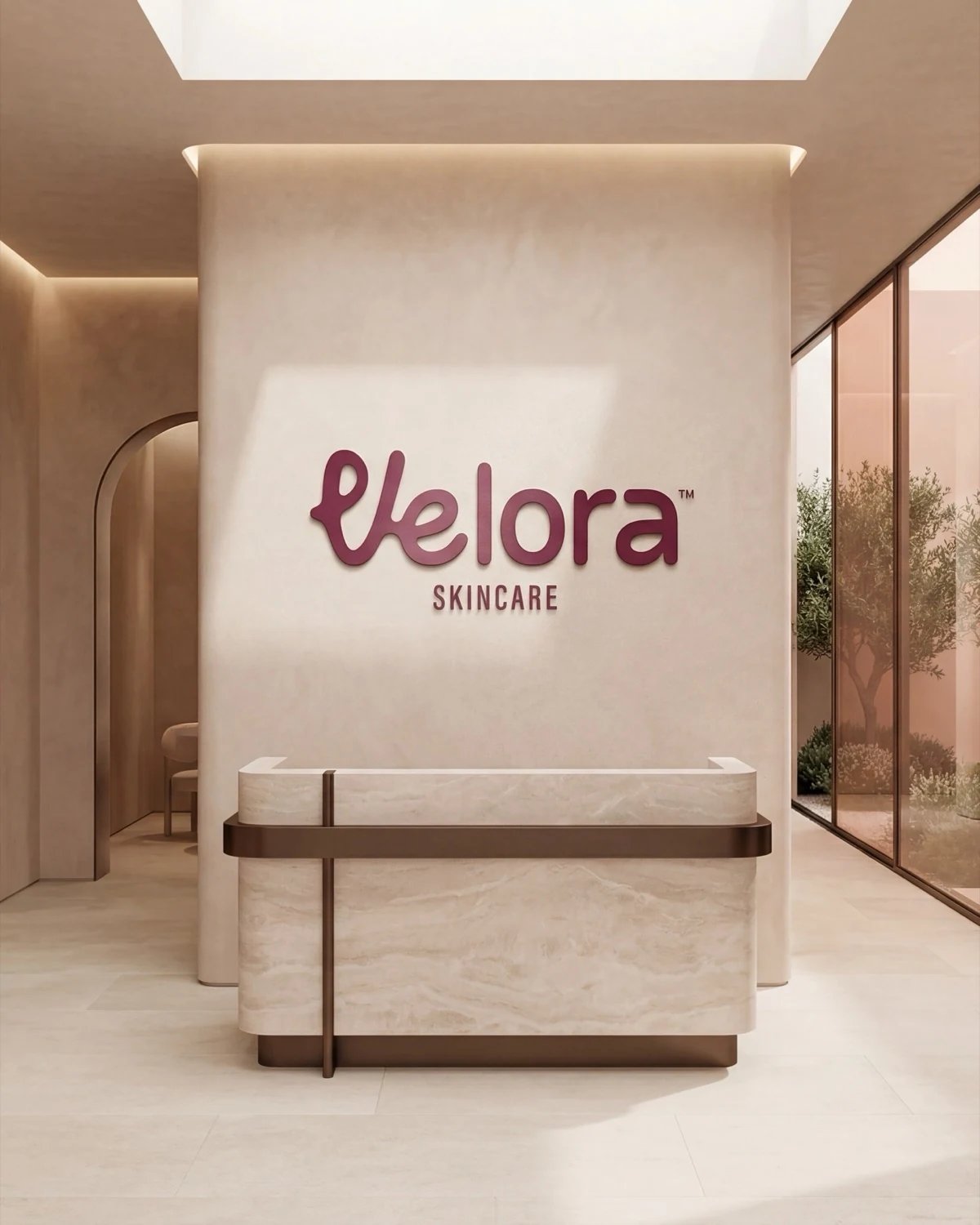
The same burgundy, from reception to the bottle.
Nine posts for the feed


The V and the e join in one line
VELORA’s V and e join in one soft line, like handwriting. See it once on a tote, a jar or the sign at the door, and you remember it.
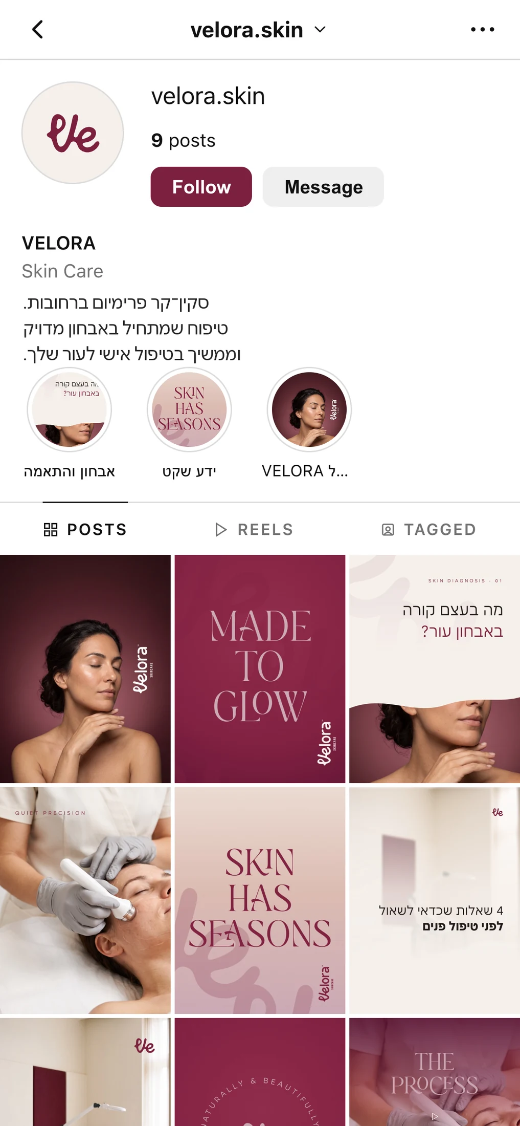
A feed you can recognize from across the room.
We planned the profile, highlights and posts as one unit. A post that teaches, a post that shows process, a post that invites you in for a treatment. And they all look like the same brand.
The bio, highlights and posts, the way a client sees them on her phone.



From the feed to the landing page
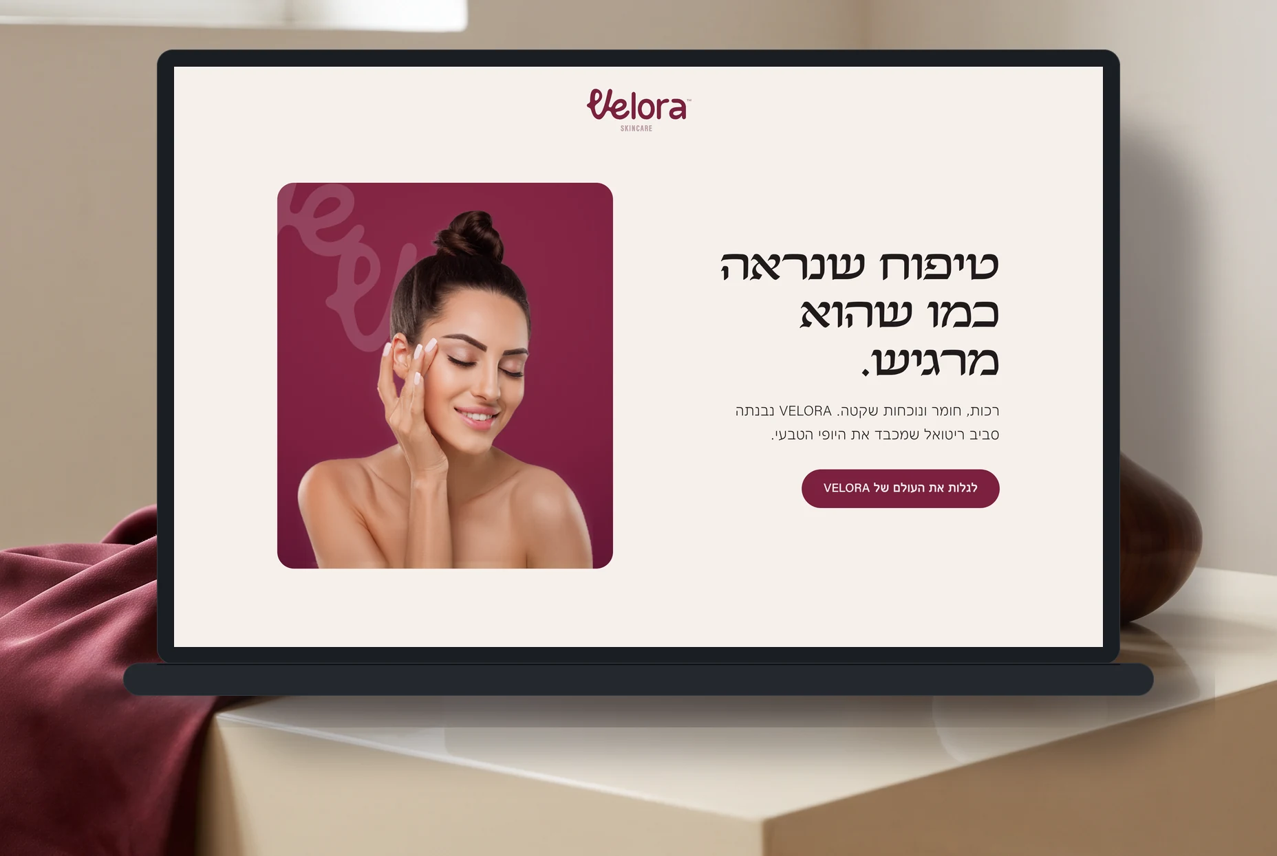
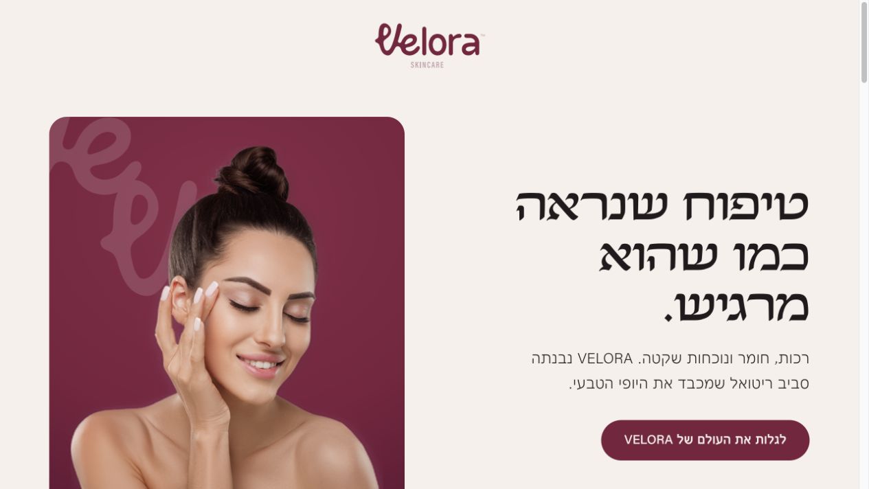
One clear page that answers what a client asks herself before she leaves her details: who are you, what is the treatment, and why come in.

How VELORA was built, step by step.
From the first sketch of the Ve, through the colors and fonts, to the feed and the campaign. Just over a minute of process.

Want to know what fits your product?
Send us a messageConcept project: a brand we built in the studio to show what we can build for a brand starting from zero.