In aesthetic care, it is easy to sound like everyone else. This brand talks about process, diagnosis and personalization instead of exaggerated results.
Back to work
Project page · clinic, diagnosis and content
LÚMERA Clinic
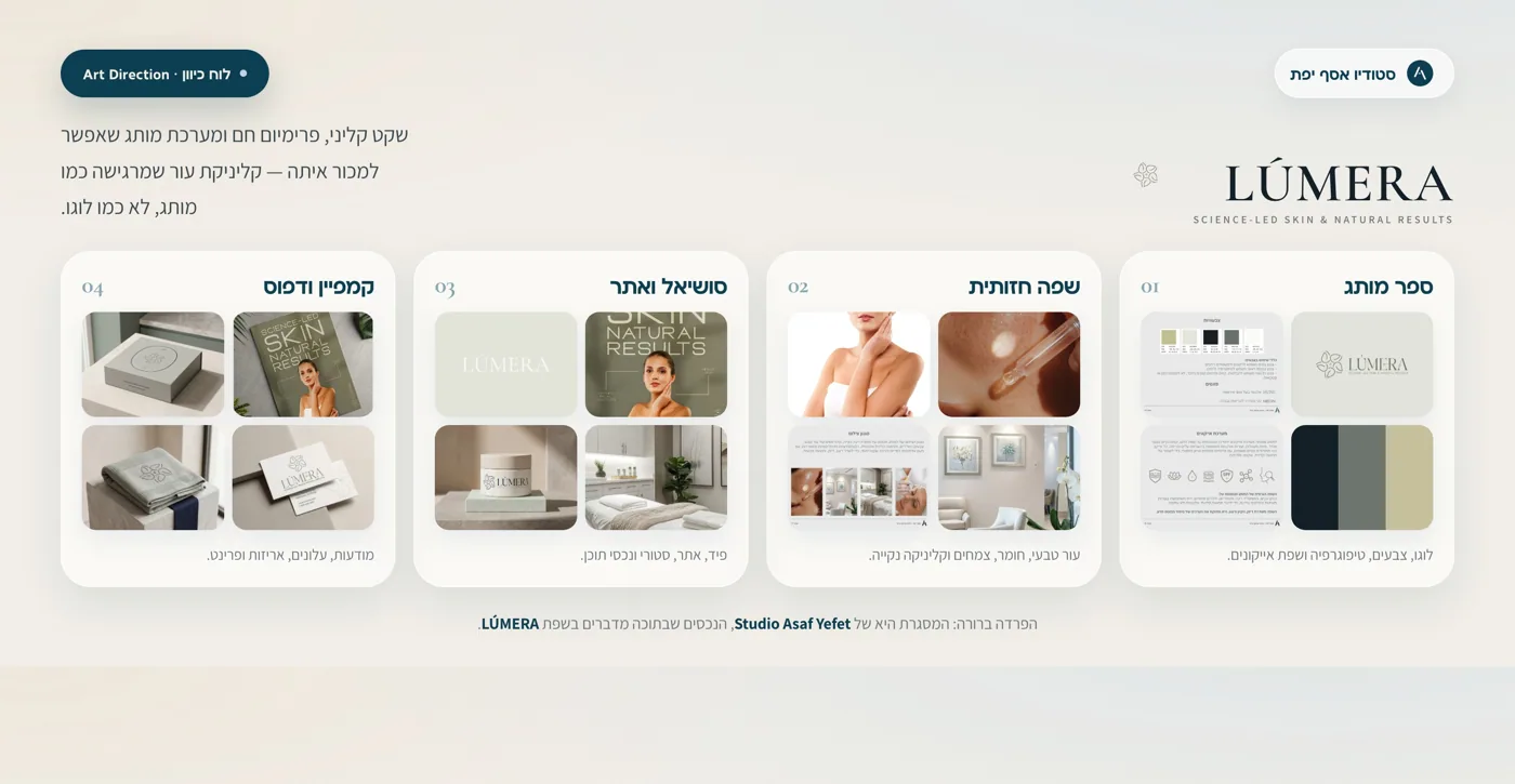
A project that shows how a medical-aesthetic clinic can feel structured, professional and approachable before the first call, with calm design, clear treatment hierarchy and content that prepares people to get in touch.
What the project proves
A clinic should not only look good. It needs to explain itself fast.
For LÚMERA, the brand language is not only there to create a premium impression. It helps a new client understand the offer: what treatments exist, what comes first, why diagnosis matters and what a professional process looks like.
The clinic needs to present treatments, products, questions and process in a way people can scan quickly, especially on mobile.
A better lead arrives after people understand that the clinic is professional, structured and honest about the next step.
Medical, but not cold. Premium, but not loud.
LÚMERA is built around sage green, cream and deep teal. The result feels clean and professional, but still warm enough for a beauty and aesthetics audience.
The messaging starts with understanding the skin, not pushing a treatment.
The imagery stays clean, airy and softly lit, with no unnecessary drama.
The design makes room for services, products, FAQs and guidance.
Posts and stories help potential clients arrive more informed.
What was built
The same clinic language, from the feed to the landing page.
The page shows how clinic branding works when it needs to look polished and explain clearly. Not just a logo, but a sequence of messages, content and real touchpoints.
Brand identity
Logo, palette, typography and a visual language that feels clinical, clean and approachable.
Treatment language
A structure that explains services, treatment areas, personalization and the difference between product and treatment.
A feed that connects results, knowledge, products, clinic atmosphere and common questions.
Stories
Short moments for questions, explanations, behind the scenes and private-message prompts.
Ads
Creative that explains who the treatment is for, why diagnosis matters and what to do next.
Landing page
A page that organizes services, answers objections and leads to a clear inquiry.
A clinic that feels organized before the consultation.
The identity is built around cleanliness, clinical calm and a sense of order. Every element should help the audience understand what is happening and why they can get in touch with confidence.
Brand character
The palette and materials create a feeling of precise care, not another generic beauty page.
#112F38
#9EA89A
#D8D8C7
#E8E5D7
#F6F3EA
Tone of voice
Professional, calming and direct. No exaggerated promises, just clear explanation that respects the client and the process.
Photography
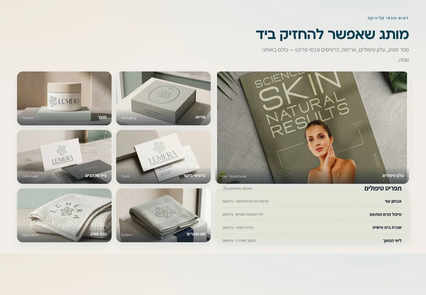
Product, skin, treatment room and printed materials, all clean and spacious, with small details that build trust.
What people actually see
A feed, posts, ads and landing page that explain the clinic.
Instead of only showing a logo or product image, the page shows how LÚMERA appears in the places where people actually meet the clinic.
Full brand picture
One system connecting treatments, Instagram, ads and landing page.
This is where the clinic moves from identity to marketing: treatment menu, posts, Instagram profile, ads and a page that explains the next step.
Instagram profile
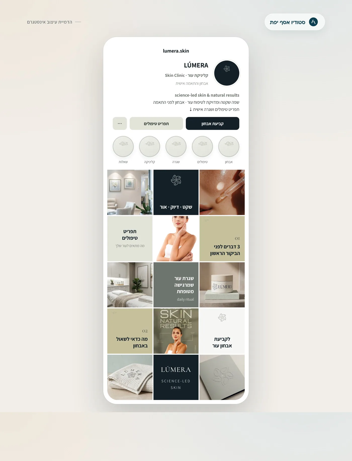
A feed that feels like an active clinic, not a static portfolio.
The profile shows treatments, products, knowledge, trust and atmosphere, so people understand what the clinic specializes in.
Post system
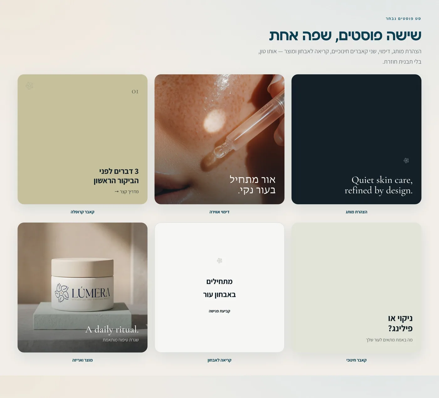
Posts with different jobs: education, product, treatment and questions.
The feed should feel rich without becoming crowded. Every post has a role, so the page builds understanding over time.
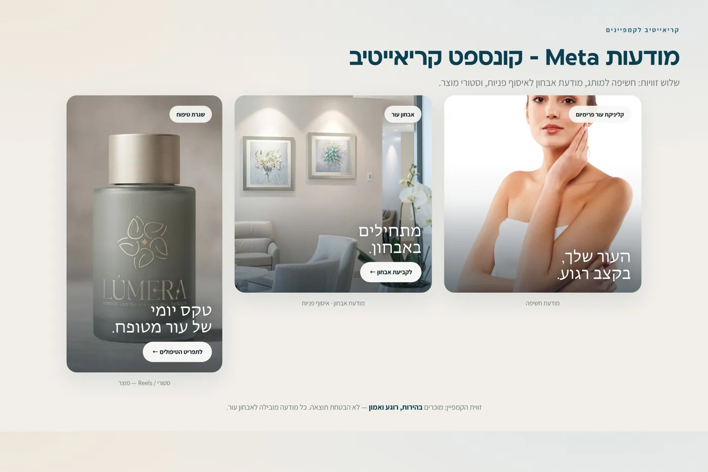
Meta ads
Ads that lead to consultation, not empty promises.
The message explains who it is for, why skin diagnosis matters and what the next step should be.
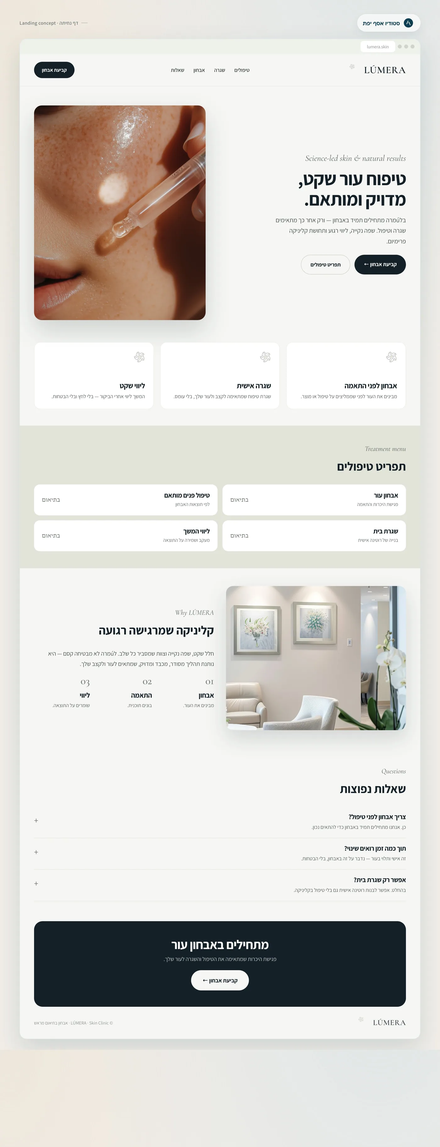
Landing page
A page that organizes services and answers questions before inquiry.
A clinic landing page needs to show approach, treatments, process and FAQs, not just a beautiful image and form.
Content examples
Clinic content should look good, but first it needs to create order.
LÚMERA content is built to educate, calm and open a conversation. Not every post is a sale. Some explain, some build trust and some invite a private message at the right moment.
How do you know which skin treatment really fits you?
An opening about diagnosis, not a promise. Then: skin condition, goal, treatment history, sensitivities and what to ask before starting.
- Subtle progress dots instead of technical slide-number labels.
- One clear sentence per screen, without medical overload.
- An ending that invites a private message with a short suitability question.
What is the first thing you would like to improve in your skin?
A simple story question that invites a real answer.
Why diagnosis comes before treatment.
A post that explains the process and reduces pressure for people who do not know what to ask for.
Before choosing a treatment, understand what your skin actually needs.
An ad that leads to a more informed inquiry, without sounding like a promotion.
What the work clarifies
This page shows that clinic branding has a business job: preparing the client before the inquiry.
A client who sees LÚMERA understands what the studio actually builds: not only attractive design, but language, content, page structure, ads and messaging that explain the clinic and filter less relevant inquiries.
Professionalism, order, calm and gentle medical understanding.
The services, why diagnosis comes first and what the next step is.
Logo, feed, ads, landing page and brand materials.
Ask privately, leave details or start with a consultation. No fake call to action.
Keep exploring the work, or start thinking about your brand.
A project page like this shows how a clinic can enter the world clearly: what it offers, how it sounds and how every touchpoint helps people understand before they get in touch.