A beautiful post without a clear idea can look premium and still explain very little. First we define the feeling, promise, tone and trust signals.
Back to work
Project page · identity, content and ads
Lumière Skin Clinic
A project that shows how a medical-aesthetic clinic can feel before the first consultation: clean, calm, professional and clear, with a visual language that builds trust across every touchpoint.
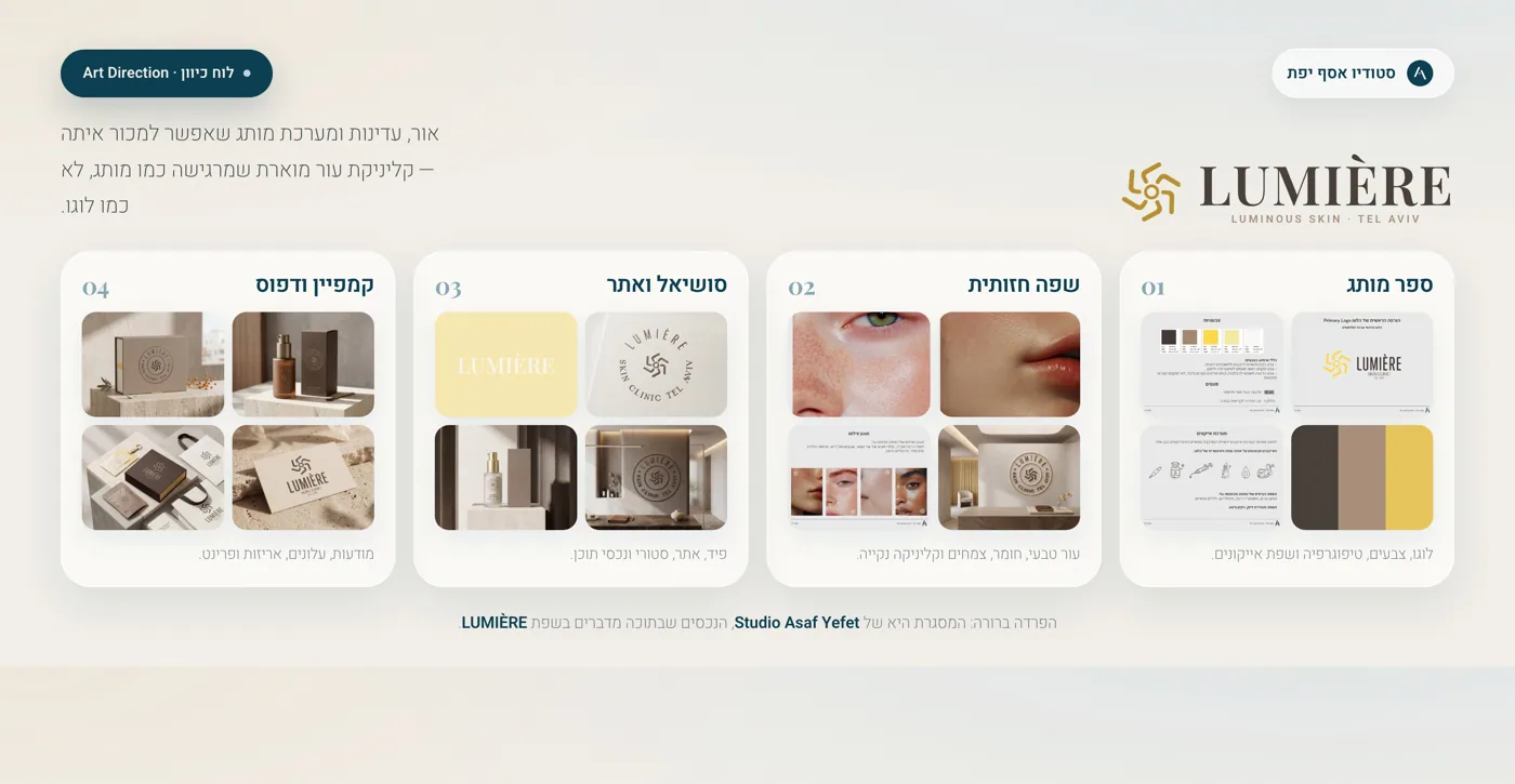
What the project proves
Good branding does not end with a logo. It continues wherever people meet the clinic.
For Lumière, the brand language is not locked inside a brand book. It continues into Instagram, stories, ads and the landing page, so every encounter with the clinic feels like the same calm, professional world.
The audience should quickly understand that this is about diagnosis, precision, safe care and natural results. Not pressure, not a sale, not another generic clinic page.
When the website, Instagram, stories and ads tell the same story, the clinic feels more stable and easier to trust.
The brand does not need to shout “luxury”. It needs to make luxury feel natural.
For Lumière, the direction avoids loud beauty codes, heavy promises and aggressive before-and-after language. The clinic lives in a softer space: medical but not cold, premium but not distant, feminine but not childish. Every decision is built around clarity and calm.
The name speaks about light, so the world leans into clean surfaces, soft shadows, open space and neutral materials.
The tone stays professional: diagnosis, personalization, precision and process, while the design keeps the experience warm.
The premium feeling comes from spacing, materials, color and restraint. It is felt before it is written.
Instead of only selling treatments, the content explains problems, expectations and the value of a consultation.
What was built
The same clinic, the same feeling, wherever people meet it.
The strength is not the number of files. The strength is that the ad, Instagram story, profile and landing page all explain the same thing: aesthetic care based on professionalism, diagnosis and a calm visual language.
Brand identity
A clean symbol, refined logo and visual rhythm that leave room for skin, light and texture.
Brand book
Clear rules for colors, typography, photography, tone and use cases, so the brand does not fall apart after launch.
Instagram profile
A balance of professional knowledge, services, atmosphere, FAQ content and posts that feel alive.
Instagram stories
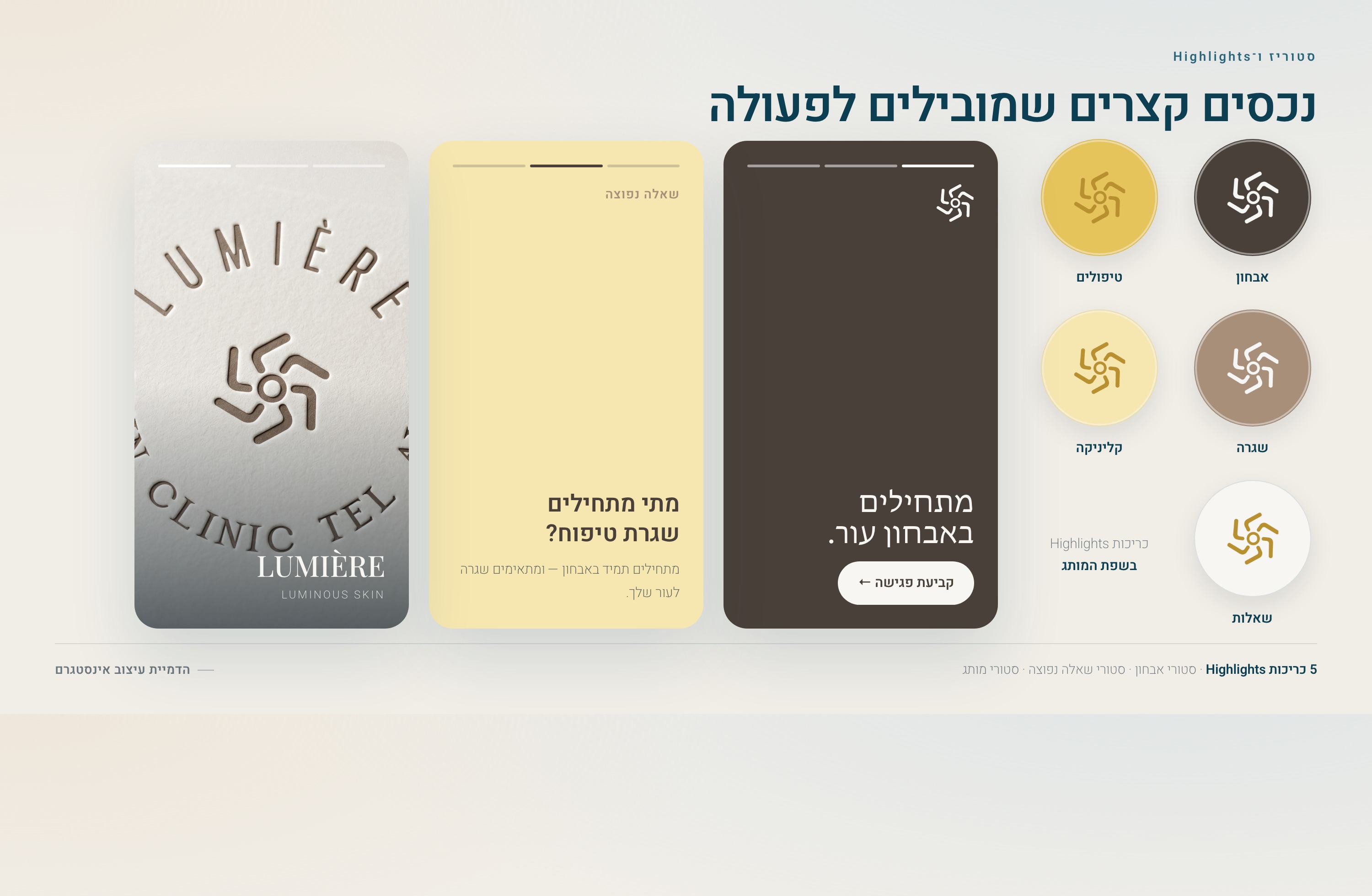
Short, useful moments: a daily question, a small explanation, a room detail or a gentle consultation prompt.
Meta ads
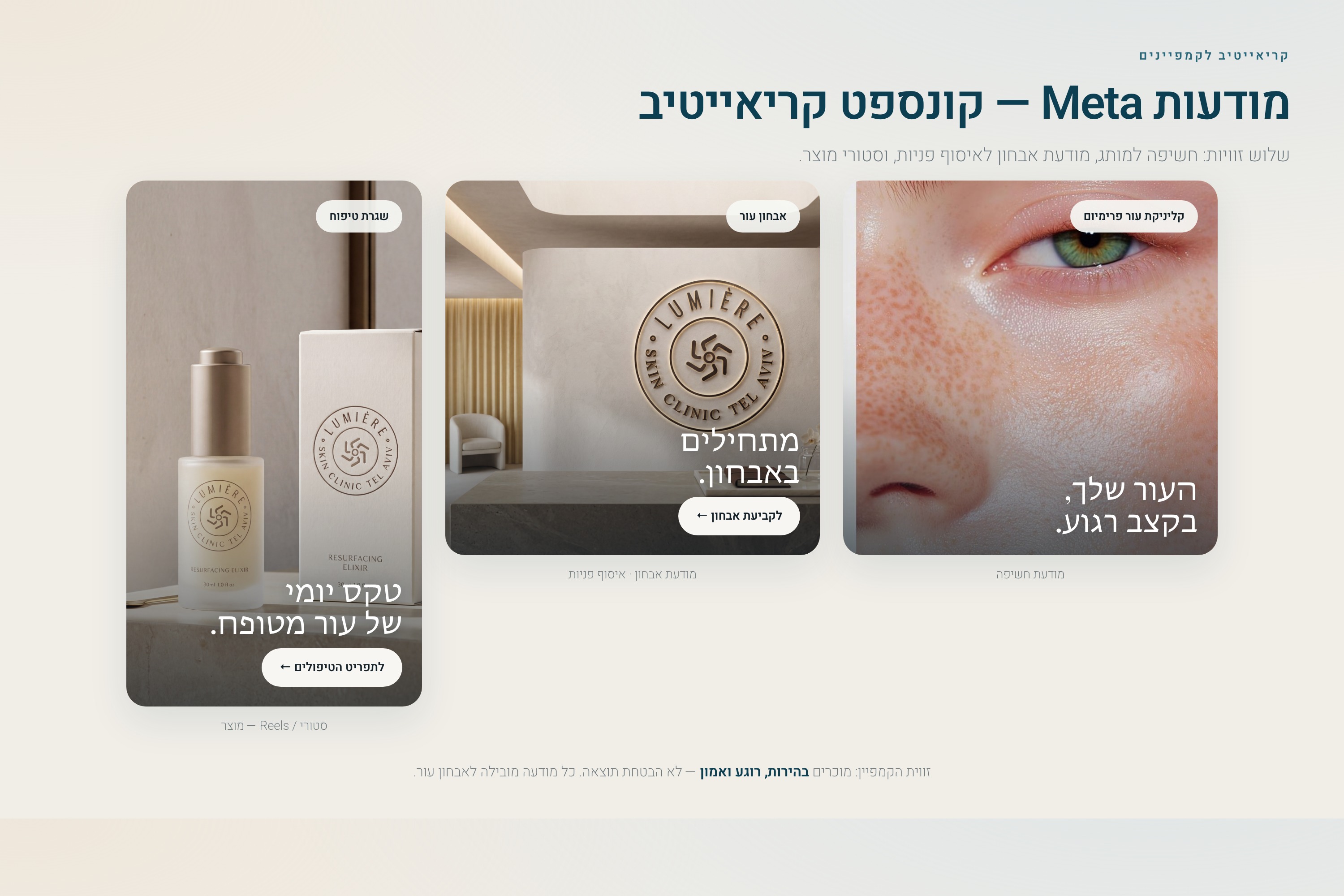
Messages that create understanding before action, instead of pushing a quick discount.
Landing page
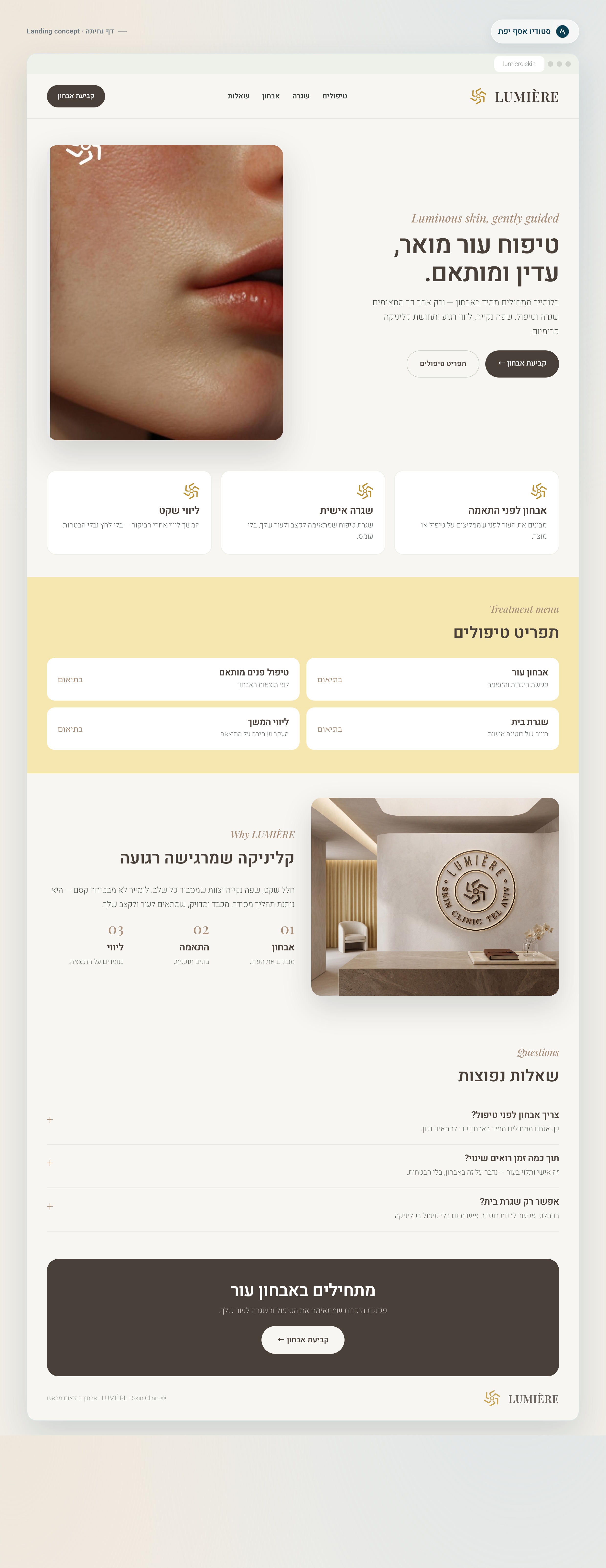
A page that explains the approach, services, common concerns and why a private message makes sense.
Quiet premium for skin care.
The identity is built around light: clarity, renewal, medical precision and a natural glow. Less noise creates more trust.
Brand character
The brand book sets the rules. The touchpoints prove that the rules work.
#4A403A
#A78F7A
#FFD967
#F6E7B1
#F8F6F2
Tone of voice
Clear, elegant and confident. Not “your skin will be perfect”, but “we’ll understand what is right for your skin”.
Photography
Soft light, natural skin closeups, open interiors and neutral color. The image should calm people before the copy starts working.
What clients actually see
From logo to real touchpoints: this is how Lumière goes out into the world.
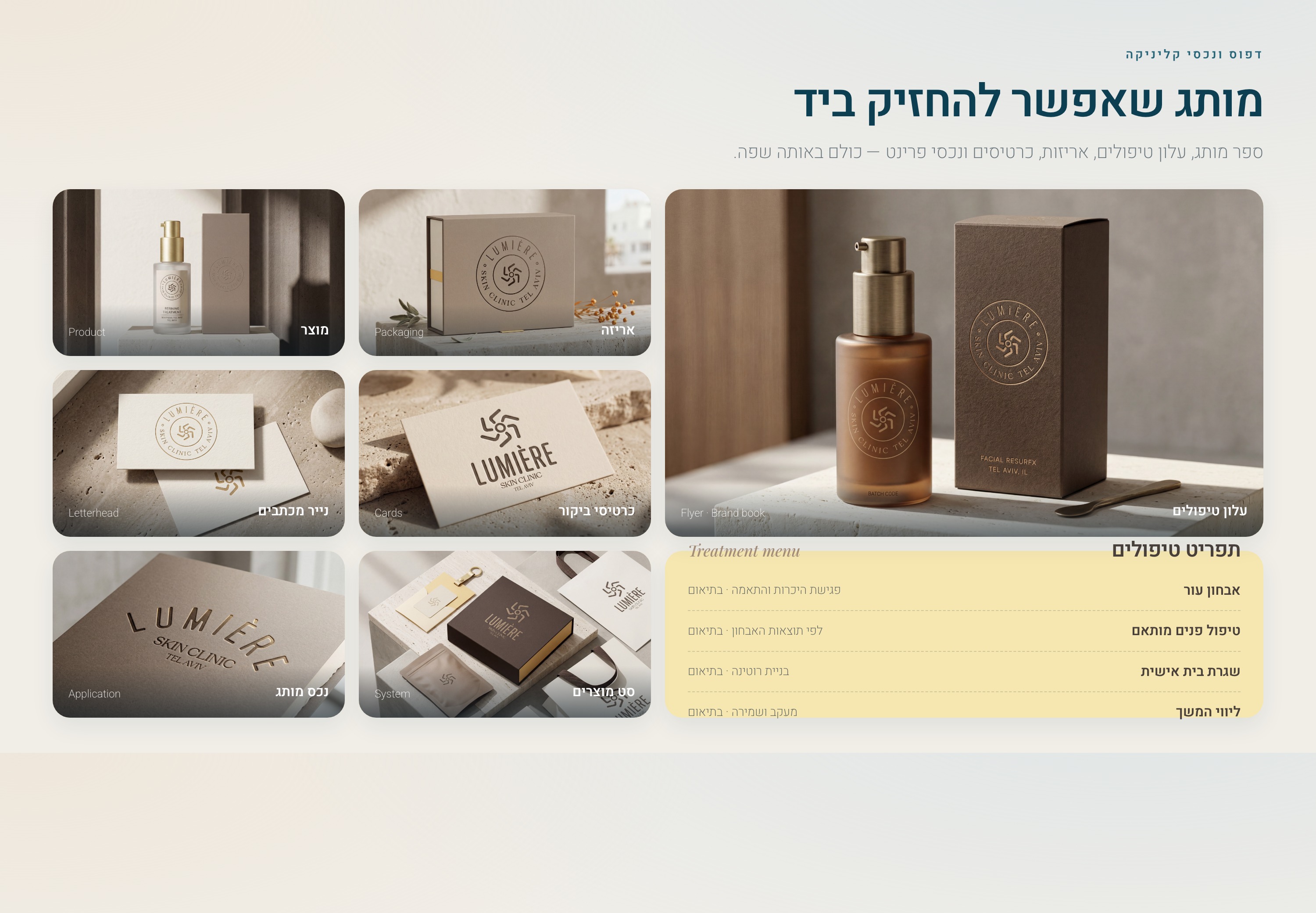
Instead of showing only pretty images, the page connects Instagram, stories, ads, a landing page and printed materials, with a clear explanation of what each part does.
The full brand picture
Website, Instagram, stories and ads that feel like one clinic.
This is where the brand language moves from identity into marketing. Each piece can stand on its own, but all of them feel connected.
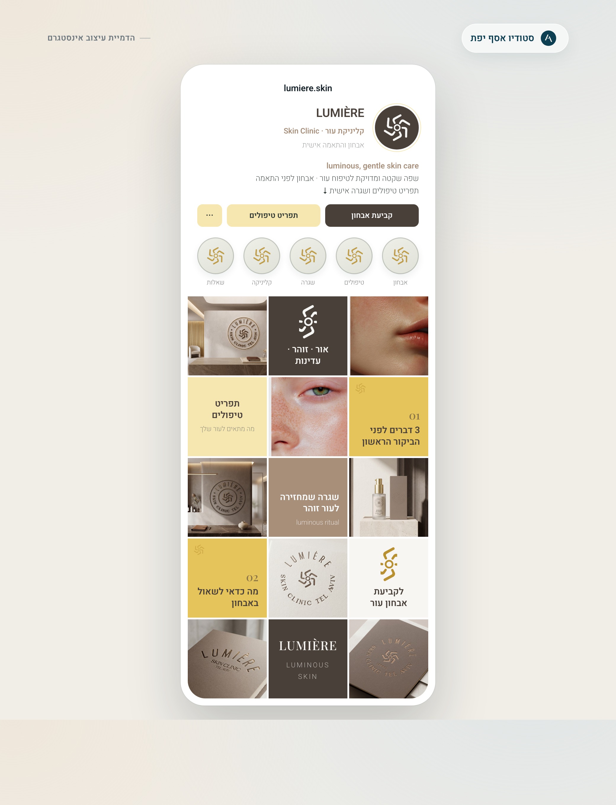
Instagram profile
A profile that feels active, organized and ready to publish.
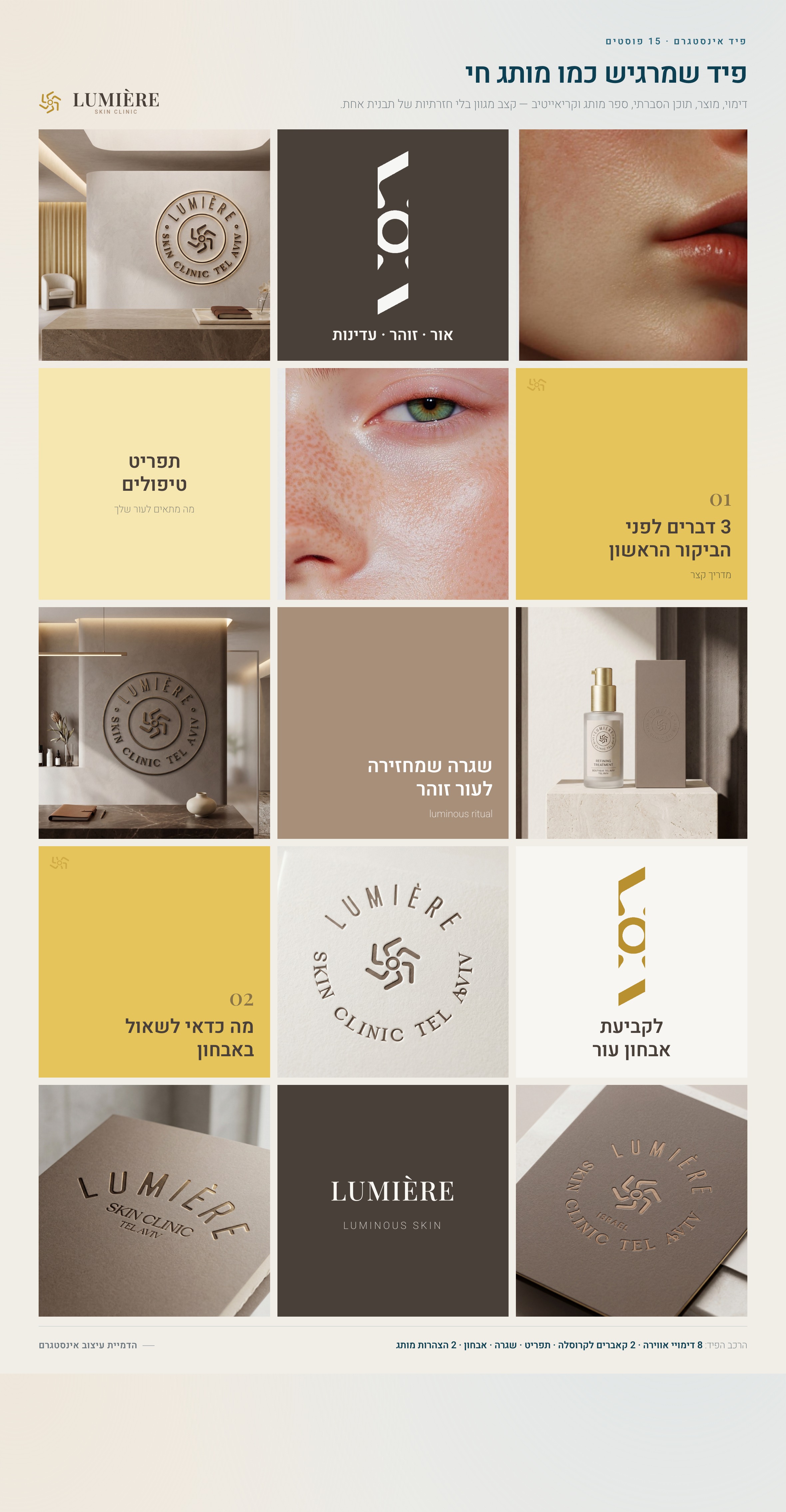
The mockup shows a complete profile: bio, highlights, buttons, content rhythm, educational posts and atmosphere. That is how a client understands how the brand behaves inside Instagram.
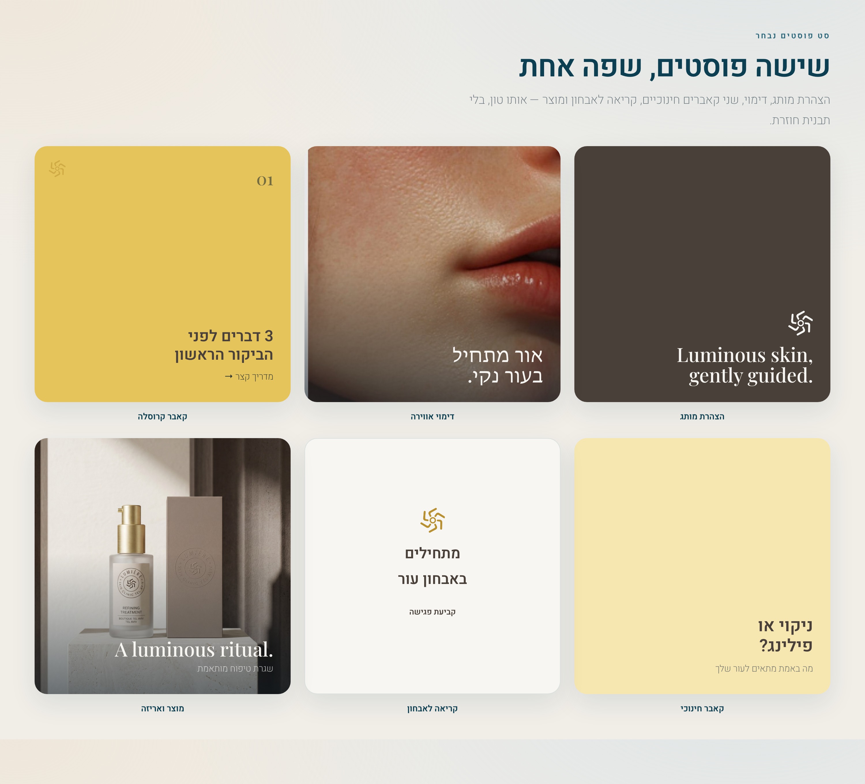
Post system
Different posts with different jobs, not the same template again and again.
There is a carousel opener, atmosphere, brand statement, product moment and consultation prompt. The goal is useful social language, not just attractive tiles.
Instagram stories
Stories that lead to actions people can actually take.
No fake button when there is no link. Sometimes it is a question, sometimes a short explanation, sometimes a gentle invitation to send a private message.
Meta ads
Ads that explain value before asking for a lead.
The ads do not sell a “perfect result”. They explain a world: skin diagnosis, treatment rhythm, a calm clinic and a clean visual language.
Landing page
A landing page that gives context before asking for details.
The page presents services, process, questions and a consultation path. It also helps filter leads, because people understand more before they contact the clinic.
Content examples
Content that explains, reassures and invites action without sounding pushy.
For a clinic like this, not every post should say “book now”. Some content builds trust, some explains gently, and some opens a private conversation after the value is already clear.
Skin looking tired? Before adding a treatment, understand what is missing.
A familiar problem, without fear. Then: possible reasons, when a consultation matters, and what not to do alone. The last slide gently invites a private message.
- No robotic slide labels inside the design. Just small dots at the bottom.
- Short copy, one strong thought per screen.
- The image stays calm so the post does not feel overloaded.
What bothers you most about your skin right now?
A short question on a clean background. It fits the story format because the real action is a reply, not a fake click.
Why we start with diagnosis, not with a treatment.
People who respond after content like this understand that there is a professional process behind the offer.
If your skin feels tired, it may not need another product.
An insight-led ad. The closing can be: “Send a private message and we’ll help you understand the first step.”
What this clarifies
This page answers the question: what do you actually get from brand work?
It shows the depth behind Studio Asaf Yefet’s work: not only a mark, but business thinking, visual language, content, social media, ads and a landing page that work together.
For Lumière: trust, precision, calm and quiet premium.
That the clinic is not selling a random treatment. It offers professional personalization.
In the brand book, Instagram profile, stories, ads, landing page and examples that show real use.
In a story without a link, do not write an action people cannot take. Use “send a private message” or ask a real question.
Visual direction
Before designing another post or ad, define the world the brand lives in.
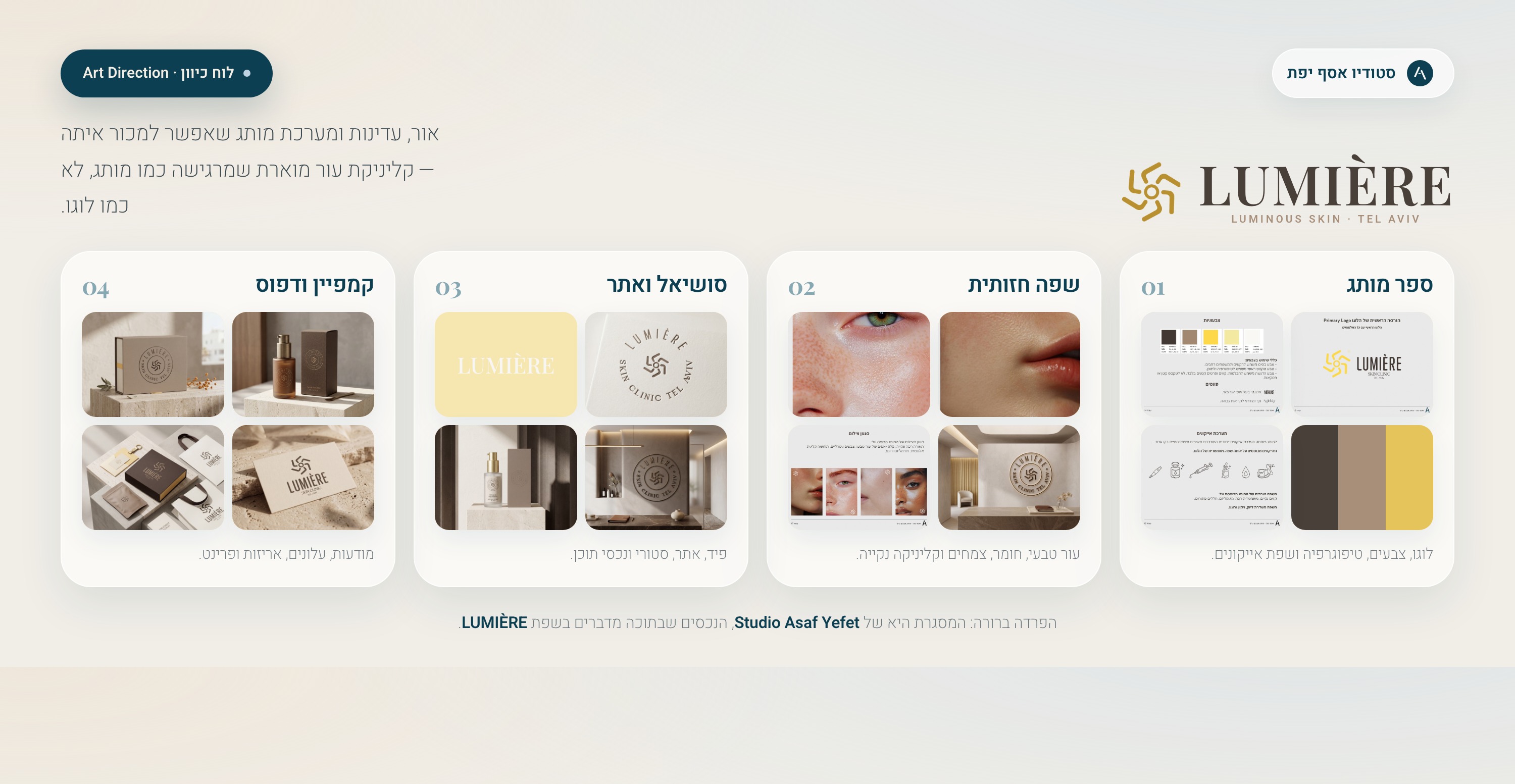
This part connects inspiration, color, photography and content rhythm, so the brand can work on screen, in print and across social media.
Art direction
Before designing posts, define a visual world.
The board shows what belongs to the brand: light, material, skin, space, colors and the level of quiet. That is why every post, ad or page feels connected.
Content rhythm
A content sequence that shows how a month can feel.
Educational posts, services, product moments, clinic atmosphere and trust-building content prepare people before they take action.
Continue to more work, or start thinking about your own brand.
A project page like this gives a fuller picture before the first call: what was built, why it looks this way, and how the same language can work in a real business.