Without a clear story, even a good-looking product becomes another box on a shelf. First we define what people should feel, remember and understand.
Back to work
Project page · product, content and sales
VELORA Skincare
A project that shows how a skincare product brand can feel before purchase: clean, feminine, confident and precise, with a language that connects packaging, content, landing page and campaign.
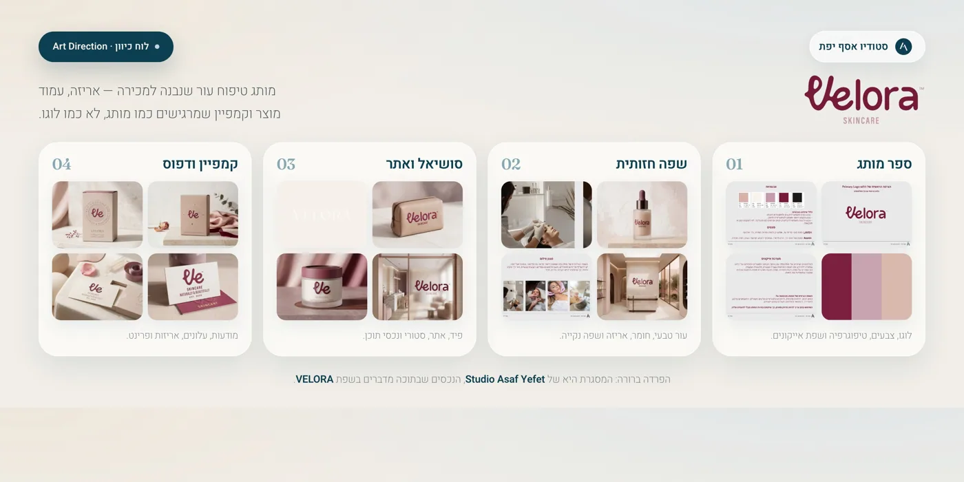
What the project proves
Product branding does not end with packaging. It needs to work on screen, in the feed and in ads.
For VELORA, the language starts with the product and packaging, then continues into Instagram, post systems, ads and a landing page. The goal is for people to quickly understand what the product promises, who it is for and why it deserves attention.
The imagery needs to show texture, light, material and cleanliness. Not just product shots, but moments that feel part of a skincare routine.
When packaging, feed, ads and landing page speak the same language, the brand feels more credible and less random.
A skincare brand that does not shout “luxury”. It makes luxury feel natural.
VELORA uses a soft, feminine and confident language without becoming childish. The palette is warm and rosy, the imagery is clean, and the copy is short and clear. The result is a product brand that can live on a website, in Instagram and on a retail or clinic shelf.
The pink world stays elegant, clean and mature. A refined skincare product, not a childish beauty brand.
Packaging, texture, light and material do the heavy lifting. Copy supports the choice without crowding it.
The premium feeling comes from restraint, spacing, typography and image rhythm.
A product brand needs to answer: who it is for, how it is used, what it feels like and why it is different.
What was built
The same product, the same feeling, everywhere people meet it.
The strength is not another nice design. It is continuity: the packaging looks like the feed, the feed looks like the ads, and the ads lead into a page that explains the product without losing the feeling.
Brand identity
Logo, palette, typography and a product language that feels clean, feminine and professional.
Packaging language
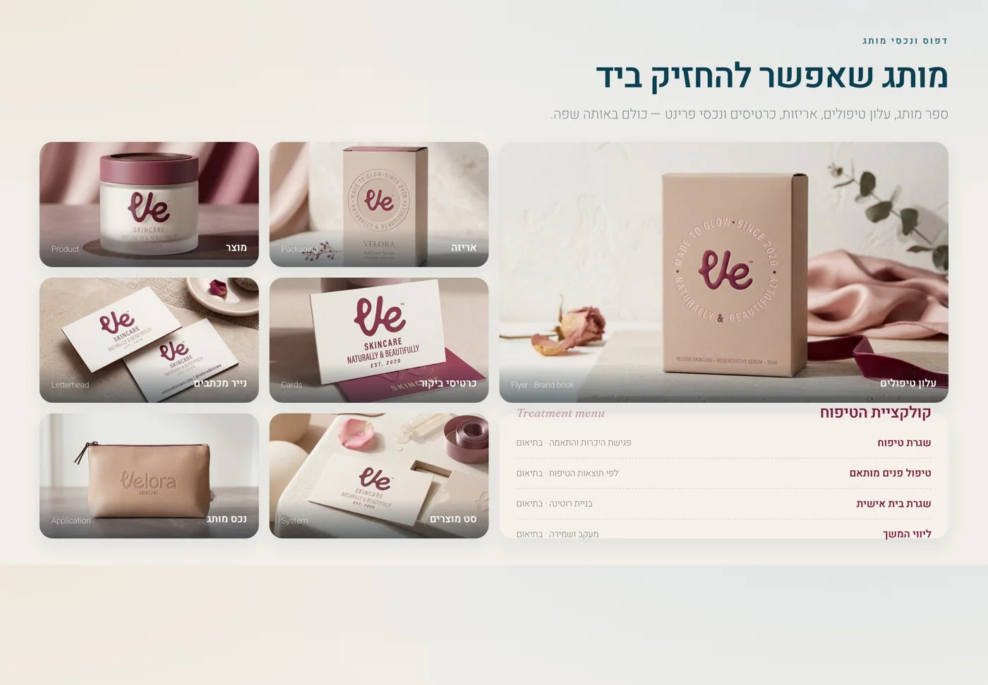
How the brand appears on boxes, labels, cards, bags and delivery details without each item feeling separate.
A feed that connects product, education, mood, usage and trust without feeling like a dry catalog.
Stories
Short moments of product, questions, tips, usage and routine, without fake buttons that are not actually clickable.
Ads
Messages that start with a reason to believe in the product, not just a discount.
Landing page
A page that presents the product, explains the value, handles hesitation and leads to a clear action.
Skincare that feels calm, clear and desirable.
The identity is built around calm skin, quality materials and effortless premium. Fewer big promises, more quiet confidence.
Brand character
The brand book sets the rules. The examples show how those rules live in the real world.
#5C3041
#B98295
#E7C4CE
#F3DCE2
#FCF6F7
Tone of voice
Gentle, direct and aware. Not “look perfect”, but “a product that feels right inside your skincare routine”.
Photography
Soft light, close product details, clean textures and generous spacing. The product should feel tangible, not generic.
What people actually see
From packaging to landing page: how VELORA enters the world.
The page connects product, packaging, Instagram, ads and landing page. Instead of only showing a beautiful box, it explains how every touchpoint helps the brand feel credible, desirable and clear.
Full brand picture
Packaging, feed, campaign and landing page that feel like one family.
Here the language moves from product to content: Instagram profile, post system, ads, landing page and brand materials. Each piece works alone, but all of them speak in the same voice.
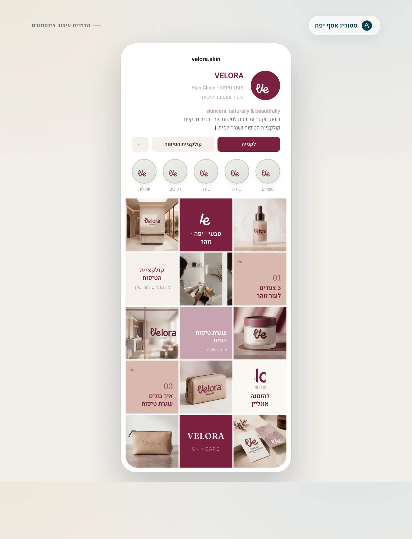
Instagram profile
An Instagram page that feels like a real product brand, not an image gallery.
The profile shows a clear bio, highlight covers, a content sequence, product imagery, textures and useful posts, so the brand can be imagined inside an active feed.
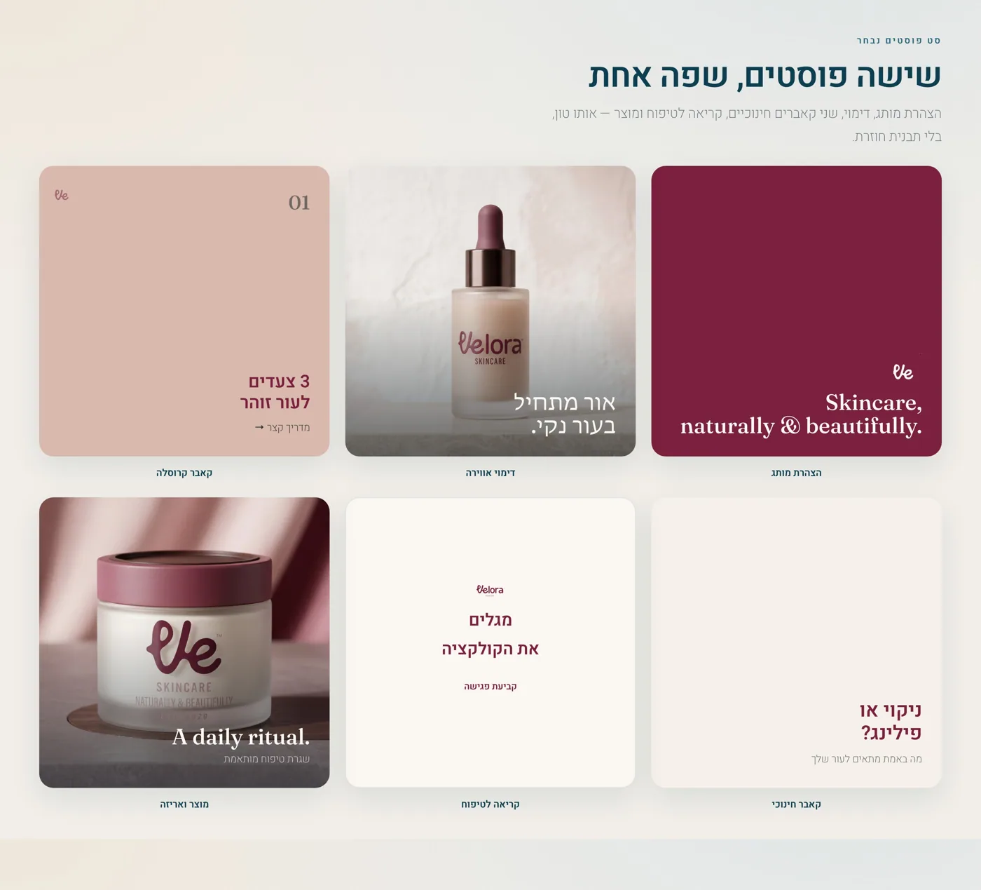
Post system
A post set with different jobs, not the same template repeated.
Some posts show product, some educate, some build mood and some lead to a question or page. That is the difference between nice design and a content system.
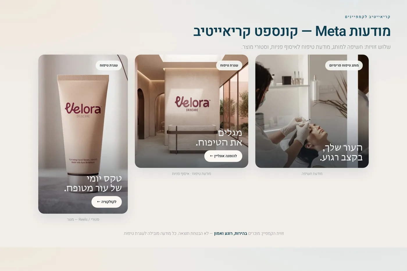
Meta ads
Ads that sell the reason to care, not only the product.
A good product ad does not start with a discount. It starts with a need, a feeling or a familiar use moment, then explains why the product is worth considering.
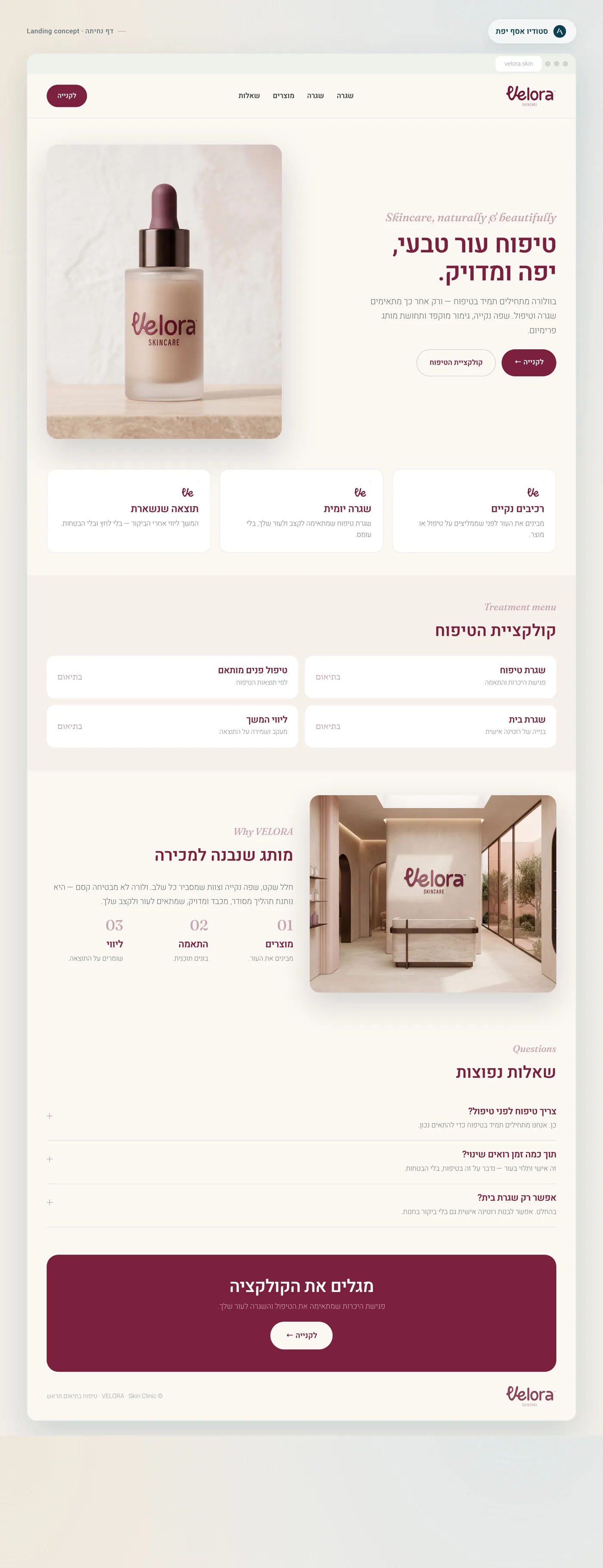
Landing page
A page that presents product, value and use in a way people understand fast.
The page gives context before action: what the product is, who it is for, how it is used, what it feels like and why it is worth exploring.
Content examples
Product content needs to create desire, but also explain.
In skincare, not every piece of content should sell. Some content builds trust, some teaches use, some shows texture and some leads to action at the right moment.
How do you know if a skincare product really fits your routine?
A clear opening about making a smarter choice. Then: skin type, texture, usage frequency, combining with existing products and what to check before buying.
- Subtle progress dots instead of technical slide-number labels.
- Each screen gets one clear sentence and an image that supports it.
- The ending invites saving the post or sending a private message with a short question.
What do you look for in a new skincare product?
A short story question: light texture, gentle scent, hydration or packaging that looks good on the shelf.
Why beautiful packaging is not enough for a skincare brand.
A post that explains why product, usage, trust, photography and product page need to work together.
A new skincare product does not start with a discount. It starts with a reason to believe.
An ad that presents a real need and leads to a landing page or private message without sounding like a clearance sale.
What the work clarifies
This page makes it clear that this is not a product factory. It is a brand system ready to go to market.
A client who sees this page understands that Studio Asaf Yefet does not just “make packaging”. The work connects product thinking, visual language, content, messaging, Instagram, ads and a page that turns attention into understanding.
Softness, cleanliness, premium feeling and confidence.
What the product does, who it is for, how it fits into a routine and why it is worth trying.
Packaging, feed, ads, landing page and every realistic example of use.
Save, ask privately, visit a product page or leave details. No fake buttons.
Keep exploring the work, or start thinking about your brand.
A project page like this gives a broader picture before the first call: what was built, why it looks this way and how the same language can work for a real product brand across real screens.